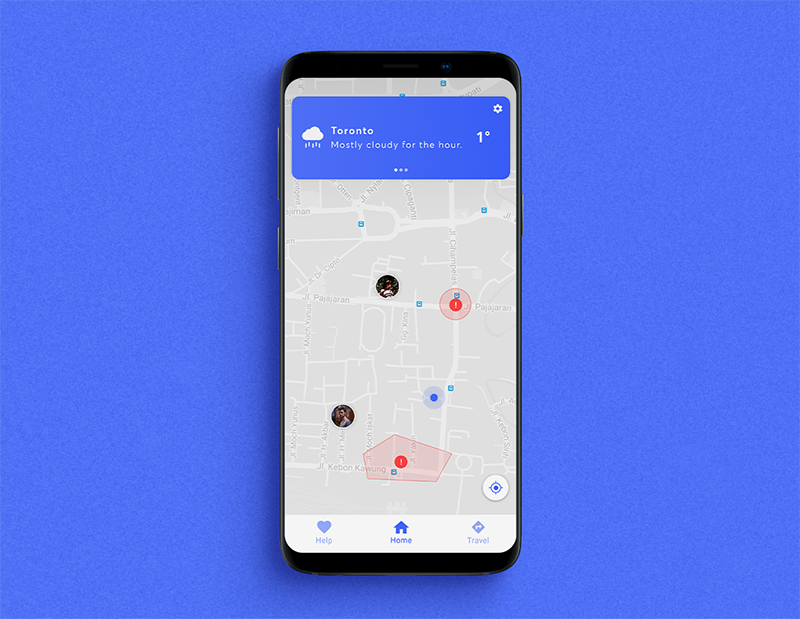
Nav Me, a smart transit app meant for parents to keep track of their children, and for teenagers on the go. With an emphasis on safety features, contextual navigation, and informative insight, this app aim’s to make a place in this heavily
contested mobile space.
INTRODUCTION
When it comes to mobile navigation, companies like Apple and Google especially have strong grips on this space, with each trying to outdo the other when it comes to their respective navigation apps, (Apple Maps & Google Maps). Even though their navigation apps are packed with too many features to count, as an Android user I noticed something that was missing — features pertaining to parents trying to mange and have insights of their children.
INTENTIONS / OBJECTIVES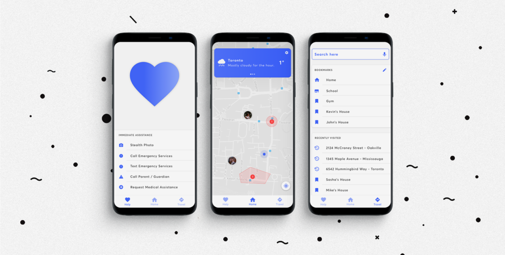
When constructing my app, it was important to find a niche that my product could fit into, as apps like Google Map’s try to accomplish all aspects of navigation. When exploring navigation through mobile spaces, I came across a feature that is present on iPhones but not on Android phones – always on location sharing. Leveraged through iMessage, Apple’s phones allow contacts to permanently share their locations at all times, so that parents can look after their teenagers — a feature that is not present on Android. So I pivoted my app towards a parent/teenager companion app that would allow parents to see where their kids are at all times. Parents would be able to be notified when their teenagers veer off track or enter dangerous areas, and I would try to cater the teenage version of the app to be actually used by the user, than just being an app that they have to have on at all times, and never use.
CHALLENGES
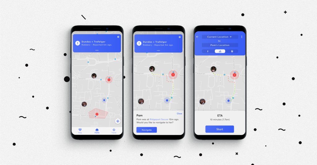
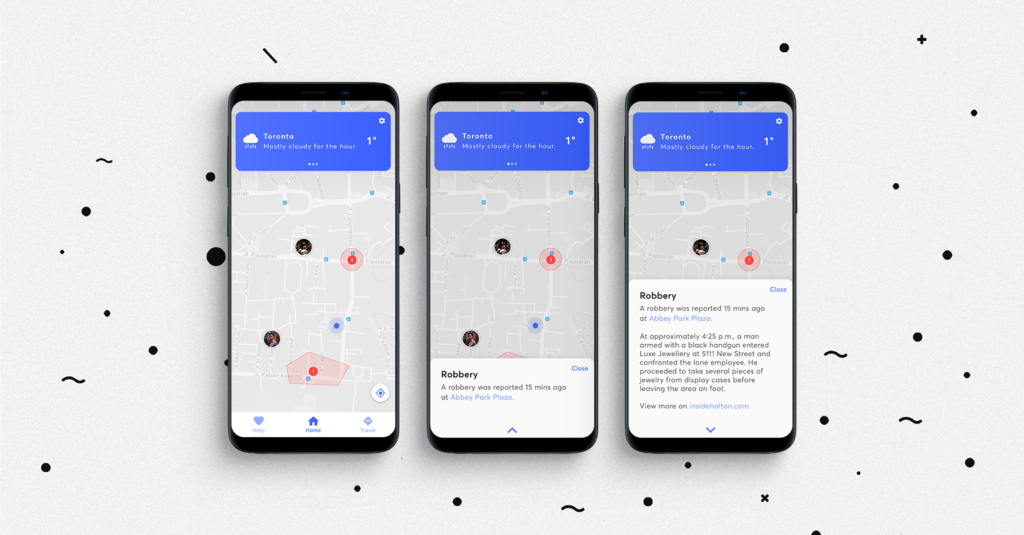
When constructing my app, a competitor (Life360) focused around the same tracking feature that my app aimed to do! To get around this I had to construct features that the app didn’t have, so I created a feature where users can see live locations of their contacts, and dangerous areas on the map that users might want to avoid. I also added the navigation functionality of apps like Google Maps, so a user would not have to switch apps when they want to go somewhere and can also quickly navigate to their friends. To further build on this idea and add convenience/functionality, the feature to save bookmarked locations is present.
PLANNING
Following my decision to go with my idea for a navigation app, the next step was to create a pact analysis and platform concept for my idea. I first decided to aim my pact analysis at kids, but after consideration — I changed my target audience to teenagers, as those would be the kids that would go out of the house with phones. Android was targeted, due to the lower cost of phones (which kids would have), and no version of the iMessage location sharing feature. The target audience would reside in the general Toronto area, (cities not suburbs), and would aim towards giving teenagers a reason to use the app, so their parents can monitor them.

USER RESEARCH
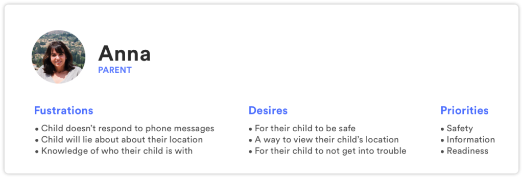
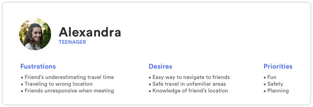
Following the creation of my PACT analysis I then thought to talk to potential users, to get their input on how the app I aimed to create should function, and what kind of features they would desire. I asked them about their current frustrations with the solutions they use now, things that they desired from their existing solution that did not currently exist, and their priorities when it came to using the app itself.
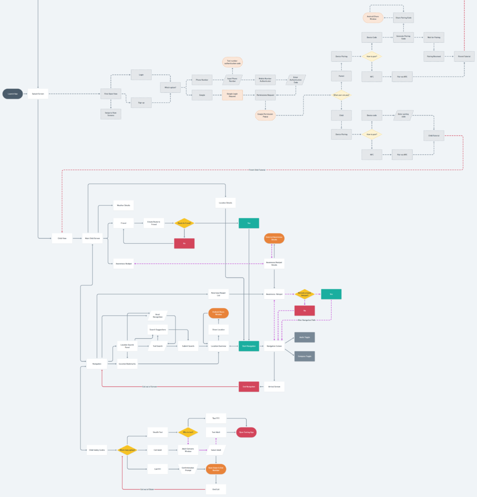
For mapping the user interactions of my app I started off my listing all of the features that I would want my app to contain. I then started to branch off these features and used Whimsical.co (A flowchart building site) to construct my flow chart. To make organizations easier I divided the chart into three main sections, those being, the parent version of the app, the teenager version, and the first start setup. The first setup flow includes user sign up/login, choosing the version of the app you will be using, pairing between a parent and their child, and a tutorial. Following completion of the first start flow, I decided to keep it single and have 3 main activity’s that would be accessible from a bottom navigation bar for both versions of the app.
USER SCENARIOS
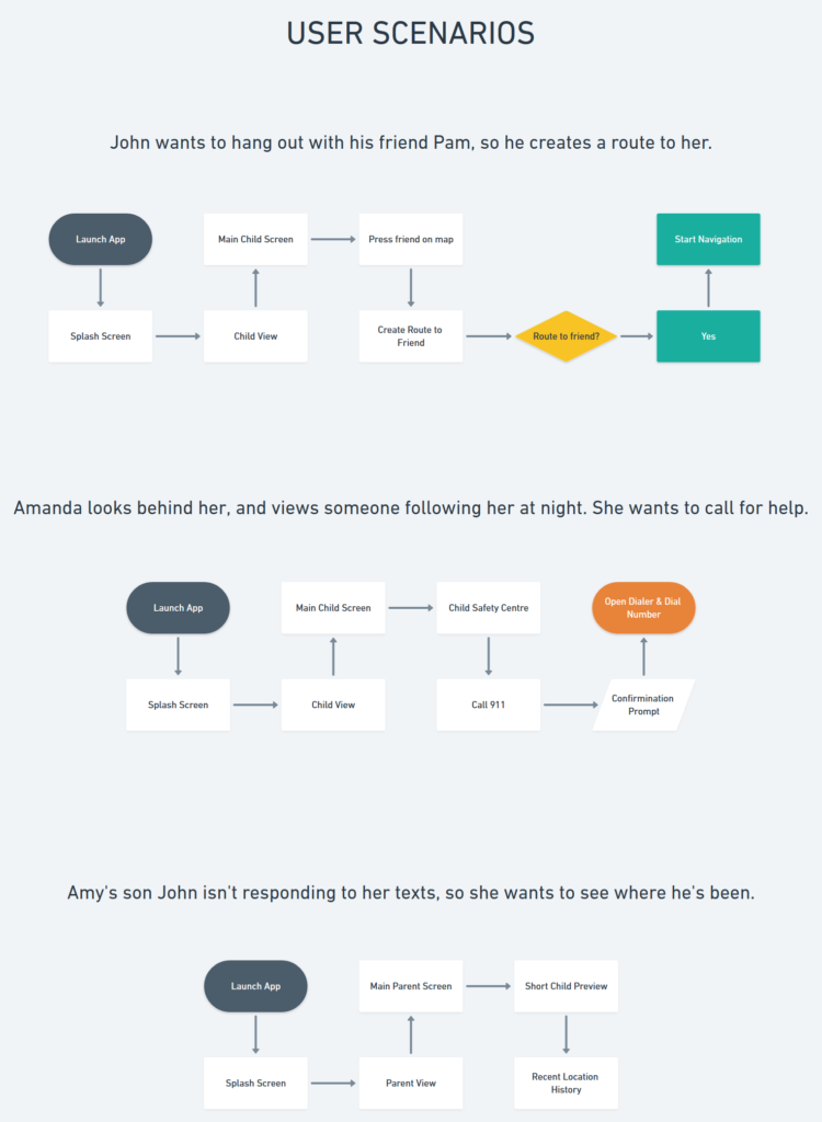
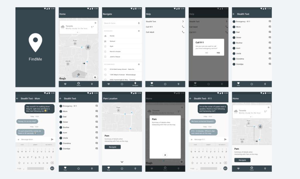
For user scenarios I illustrated three use cases, the first being a user trying to navigate to their friend, the second a user trying to use the emergency functions, and the third a parent trying to view where her child is. After completion of my user scenarios, I sketched out my flows into low fidelity wireframes, and then transferred them into high fidelity wireframes.
WIREFRAMES
When it to developing my high fidelity wireframes, I decided to take a look at material.io and create my high fidelity wireframe according to Google’s material design framework for Android app development. I did this to gain greater insight on the framework, and use this project as an opportunity to familiarize myself with the standards and boundaries that Google compels app developers to follow. By doing this, I was able to correctly lay out my app, have a rationale type system, and could bring forward the information I learned from this when doing more mobile design after this project.
When it came from transferring my low fidelity wireframe sketches to higher fidelity digital ones, there was some changes that I made when I realized some of the layouts had more effective ways to be done. I took these problem artboards, (mostly the main activity interactions & help screen), and iterated on them until I found better ways to lay out the user experience.
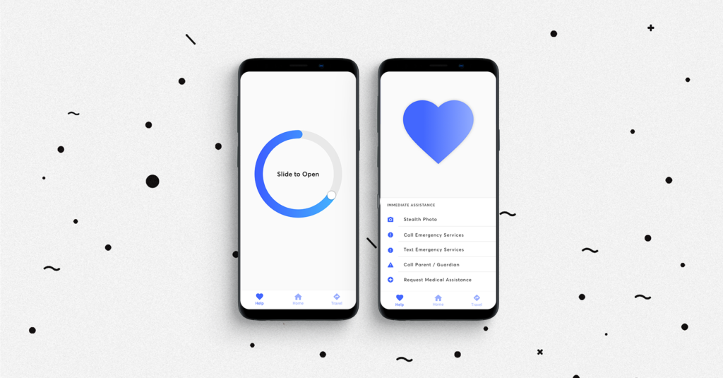
For the help activity, this screen went through a few iterations and redesigns. At first it was a drawer with features, then went into a simple stylized list like the list in the navigation activity with additional information and a FAQ. From here I realized that a FAQ was unnecessary as the user would only visit this screen if they had an immediate need to, so I removed the FAQ and left just the shortcuts for receiving assistance. With this design I was faced with an empty amount of space at the top of the screen, so I struggled on what to put there – if not more information. Eventually it dawned on me that I could fill it in with an illustration to make it more balanced. So instead of empty space I put a simple iconographic heart. Something else I considered when creating this screen was some of these options would dial emergency services, and if dialed by accident could have consequences. So for this problem case, I added a swipe to unlock feature, so the options wouldn’t be accidentally pressed.
VISUAL DESIGN SYSTEM
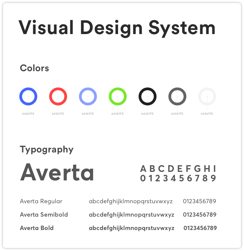
When crafting my visuals, my initial instinct was to create a moodboard of current design trends so I had some inspiration to go off, and that the visual theme of my app looked up to date for 2018. Some trends I noticed were: subtle uses of gradients, heavy contrast between typography (same typeface, different variations), bright colors, subtle drop shadows, rounded corners, generous spacing, and adaptable designs that can react to notch’s. 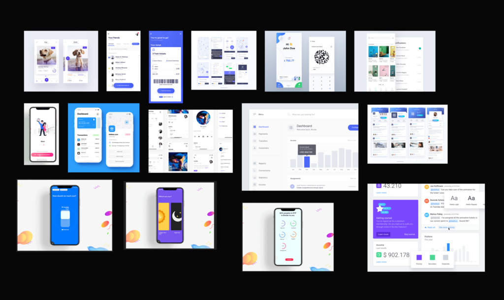 In creation of the visual theme of my app I went through a few variations of fonts and color choices. The final design system that I created for my app consisted of using the typeface Averta in three different weights and colors depending on the interaction that was being used. For interactable elements, these would be colored blue, and danger zones would be red to symbolize danger. My reasoning for choosing the color blue over others, is that it distills a feeling of trust and confidence within the user. Rounded corners offer an element of humanism to the design, and dropshadow’s offer a sense of depth from the material design framework.
PROTOTYPE
https://projects.invisionapp.com/share/PRP9F53CZVT
REFLECTION
Overall I was very satisfied with the outcome of this project. I learned how to create user flow charts, user scenarios, learned how to prototype, and how to create a visually engaging presentation for my app. Even though I’m happy with the outcome there still are some things that bother me about my product. The first being that the tutorial and parent version weren’t present, and the parent version is especially important to my app as it’s the companion to the teenage version. Something I feel was weak in my project that I could improve on was the visual theme. For this project I focused more on the UX and the UI suffered as a result of this. Systematically it’s correct, but I could have enhanced my login screens and help screen with illustrations which would have made my app much more immersive and have created more interesting uses of colors than just a flat wash of blue.
