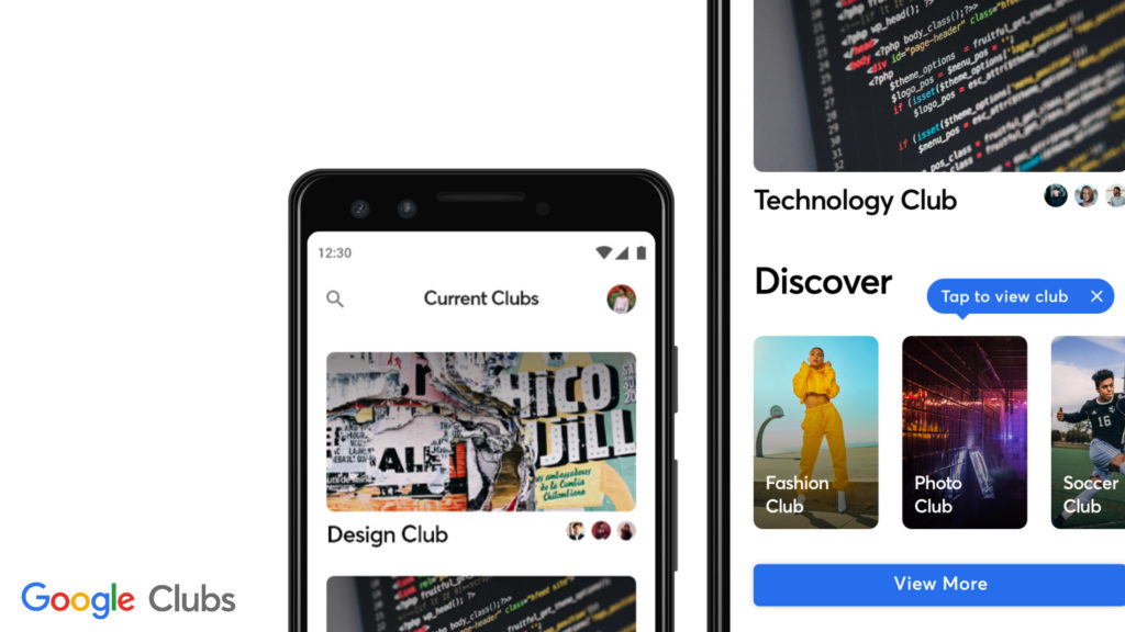
PROJECT BRIEF
Design an experience for new students to browse, search, and propose new student organizations with your overall process (1 Week Duration).
INTRODUCTION
When students leave high school and take their first steps into post-secondary education, their initial experiences can often be daunting and apprehensive. When approaching college and university, high school students might be going to school in a new area, with new people, and have to make new friends — which can be an issue. The reason being, that many students may are shy, and 1 in 5 college students deal with anxiety. When approaching the inverse side of the issue, club organizers often have a challenging time communicating with students. To better help organize this information, a design challenge was constructed:
How could I design a product that enables students to easily and supportively gain access to information about their school clubs, as well as being useful for club organizers?
IDENTIFYING THE PROBLEM
My first step into development is to understand the problem that will be resolved
by the creation of my product. To do so, I had to identify the following:
• Who are the users?
• What are the issues?
• How are the issues affecting the users?
• What are solutions that have failed to work?
• What are the current solutions?
For the identification of users, there are two main ones; high school students and post-secondary students (college/university). The brief provided for me listed it as “new students”, but does not specifically identify whether it’s for primary, secondary, or post-secondary education. Focusing my product on students as a whole is to broad for a target audience (due to the difference in age brackets), so I had to choose to focus on one. For this, I decided to set my target on high school students entering college/university – the reason being that – club engagement is of greater importance in post-secondary programs, where classes and lectures are set up in a way that is difficult for students to socialize with each other. Consequently, this specific age demographic would have a greater use for a product that helped introduce them to school clubs.
USER RESEARCH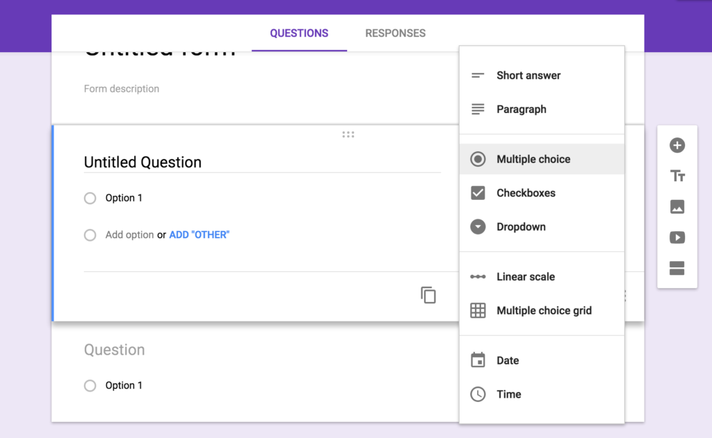
When it comes to school clubs, I’m a part of the one for my program, so I thought it was important to have an unbiased approach when trying to develop functions/solutions. To do this, I approached students new to university/college who had been apart of clubs and who had not been apart of clubs. I also thought the knowledge/expertise of club organizers/ executives were worth to pursue as they are an integral part of school clubs themselves, and could help me gain an insight of how the inner workings of school clubs operate. When it came to the contents of these interviews, I derived the following factors of importance from students:
• Unaware of where to find information about clubs
• Would like a list of clubs on social media with associated contact info
• Social anxiety is a deterrent
• Lack of existing friends in desired clubs
• Not regularly on social media
• Club forums are only in-person, not digital
• Club posts/announcements are easily missed
• Too much work to create a club
USER RESEARCH TAKEAWAY
Club owners were also asked to give their comments on the state of their clubs affairs. When club owner’s interview responses were recorded, the following were points of importance:
• Attendance of general members decline as the year goes on
• Reliance on Facebook as the main form of operation/communication
• Notable decline in students usage of Facebook
• Estimated event attendance on Facebook is unreliable
• Issues with club shared Gmail (Google security alerts)
• Group members constantly miss out on events/information
• Complex system of ratification by school for clubs
• Club awareness is usually acquired in-person, not digitally
I think that a main takeaway from students and club execs is that, student’s need an accessible way to view information, while club execs have obstacles in communicating with students. Both could also benefit from a greater level of convenience, while students could also use assistance in socialization.
COMPETITOR RESEARCH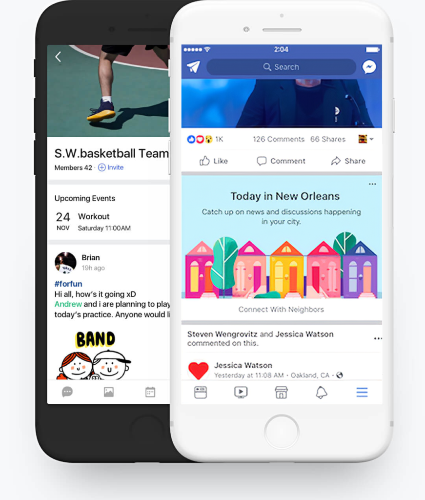
In the search for competitors, the space for student clubs is surprisingly sparse, most likely due to the social media giant Facebook, which has functions for groups. Facebook benefits from easily on-boarding users to their platform as they have an active count of 2.7 billion active users across all their services, but when it comes to club management, they fall short due to the magnitude of the platform, and here are some reasons why:
• Group content can be buried by other content
• Not everyone is active daily/weekly on Facebook
• No school club specific features
Band is another competitor in this space by a Korean ISP called Naver. Band excels over Facebook when it comes to club specific features and not burying content, but when it comes to it’s execution, it falls short on these aspects:
• Trying to leverage all communication to chat rooms
• Targeted at “groups” as a whole – too general for school clubs
• Confusing UX flow in general
SOLVING THE ISSUE
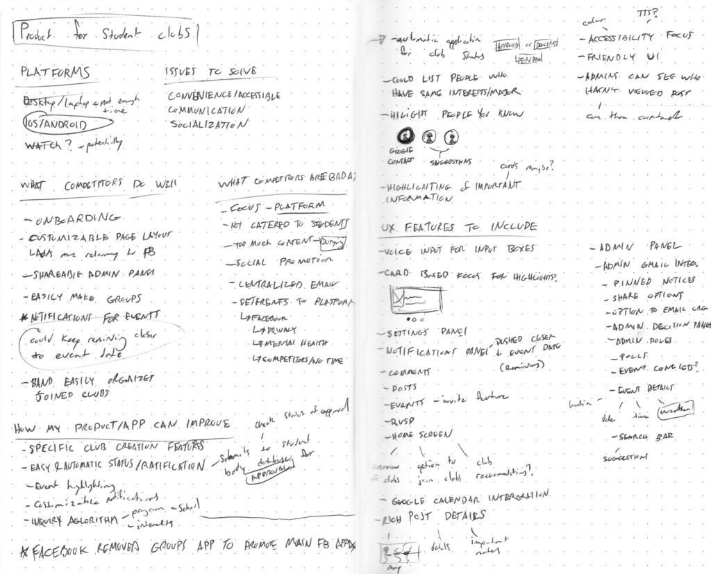
When referencing back to me initially identifying a problem, through my research, I successfully answered the questions of who the users are, what their issues are, how their issues are affecting them, and what their current solutions are. The next step was to combine together the answers I attained from this, together with my design challenge, to construct a product that would be beneficial for its consumers. Solutions to the problem were developed through sketching, as well as ways to further improve upon the already existing solution, which in turn would allow me to construct a wireframe flow.
WIREFRAME SKETCHES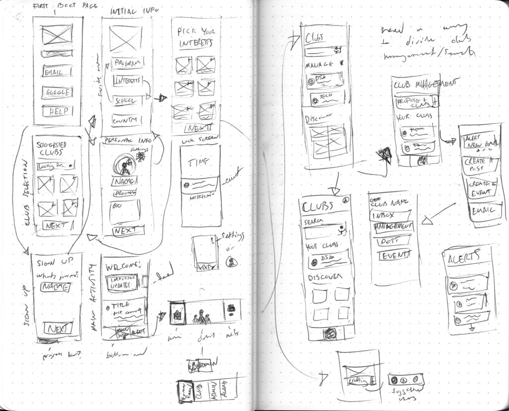
Before constructing my wireframe flow digitally, I sketched out my ideas first, as I knew once I got to the computer I would start pixel peeping and try to make my wireframe perfect – which one obstruct my productivity. I initially started off with just blocking in the features that I want present in each wireframe, and then started to make refinements, and iterations of screens.
LOW FIDELITY WIREFRAMES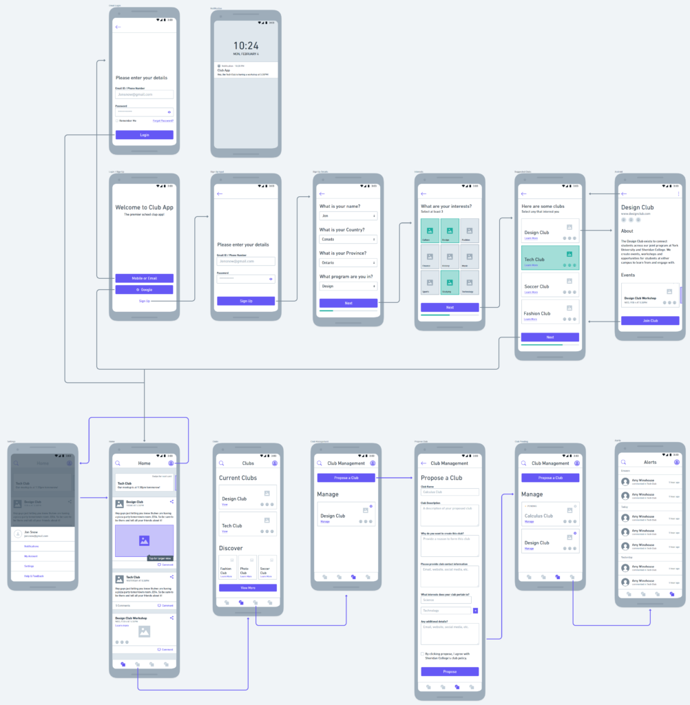
To construct my wireframes I used a new design tool called Whimsical, to reconstruct my sketched wireframes digitally. I use whimsical rather than a program like Sketch, as Whimsical is a component oriented wireframing tool, which makes it faster to block out wireframes then in most of the popular design tools. As my wireframes were transformed digitally, I realized that I had more functions and features than in my sketches, so my layouts had to be adjusted accordingly. Another thing I had to start doing was creating content to fit inside my wireframes. I had to do this so my users wouldn’t have any troubles with comprehension, when I got to the stage of user testing.
WIREFRAME PROTOTYPE
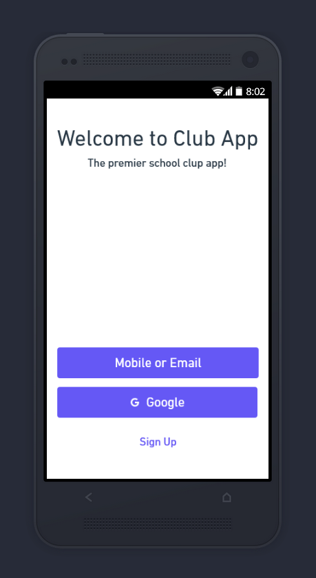
Following the completion of my low fidelity wireframes, I didn’t want to rush to the high fidelity stage yet, but instead wanted test my application first to make sure the user flow made complete sense. To do this, I exported all my artboards, imported them into Invision, and created a simple prototype that I could conduct user testing with. For user testing, I created a scenario for creating clubs, since this is a main function of my app, and allowed users to test it using the Invision phone app. I also created other tasks for users to conduct, like signing up, to test out the entirety of my wireframes flow.
View the Invision Prototype at:
SOLVING USER ISSUES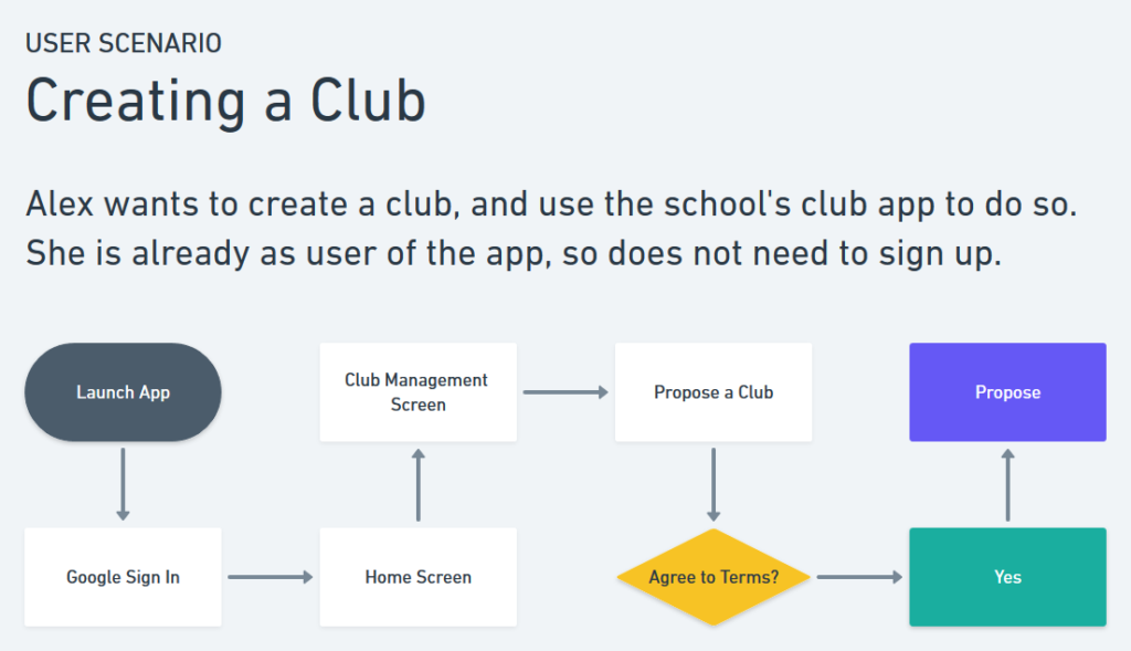
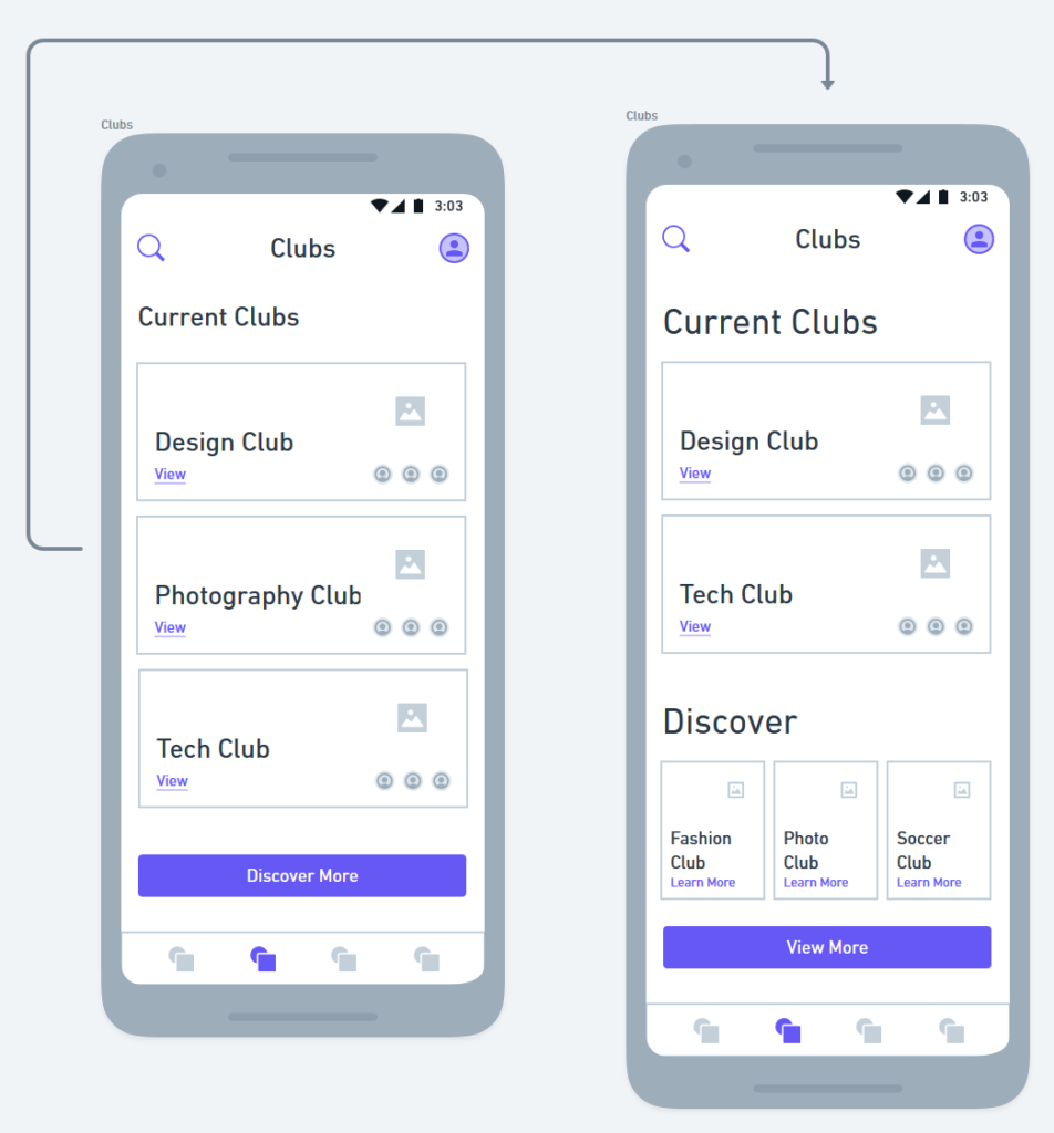
When running my user scenario by a few users, they had no issues when trying to figure out how to create a club. Through the responses I
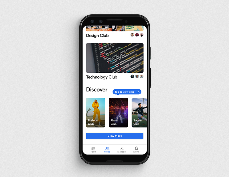
received, creating a club was successfully straight forward. Something I found through observation, is that users had trouble figuring out the functions of the bottom navigation bar, due to the omittance of icons. This wasn’t a big issue, as they would eventually get corrected. Even though I noticed this was a pain, users quickly learned the functions of the buttons by exploring the app. When getting users to test out the rest of my app, all seemed well except for the discoverability of clubs. The “Discover More” feature was unnoticed, so I added a card list of clubs above it, so a user can notice potential clubs without
going out of their way to search for them.
HIGH FIDELITY SCREENS
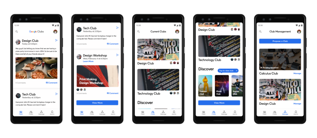
To start off my production of my high fidelity screens, I exported my artboards from Whimsical, and then placed them into Sketch. Using Google Home & Google News as reference for a visual theme, I themed by app to the likes of Google’s apps to keep brand consistency across apps (If this was an actual Google app). Once visually updating my wireframes, and formatting them to the material design specifications, I saw that there were things like that didn’t function well in my design, like text/icons over images. This looked fine in the wireframes where I had no photography, but in the high fidelity screens this created issues of contrast. To fix this, I lowered the type and icons under the image cards of clubs, to create greater legibility between text.
ACCESSIBILITY TESTING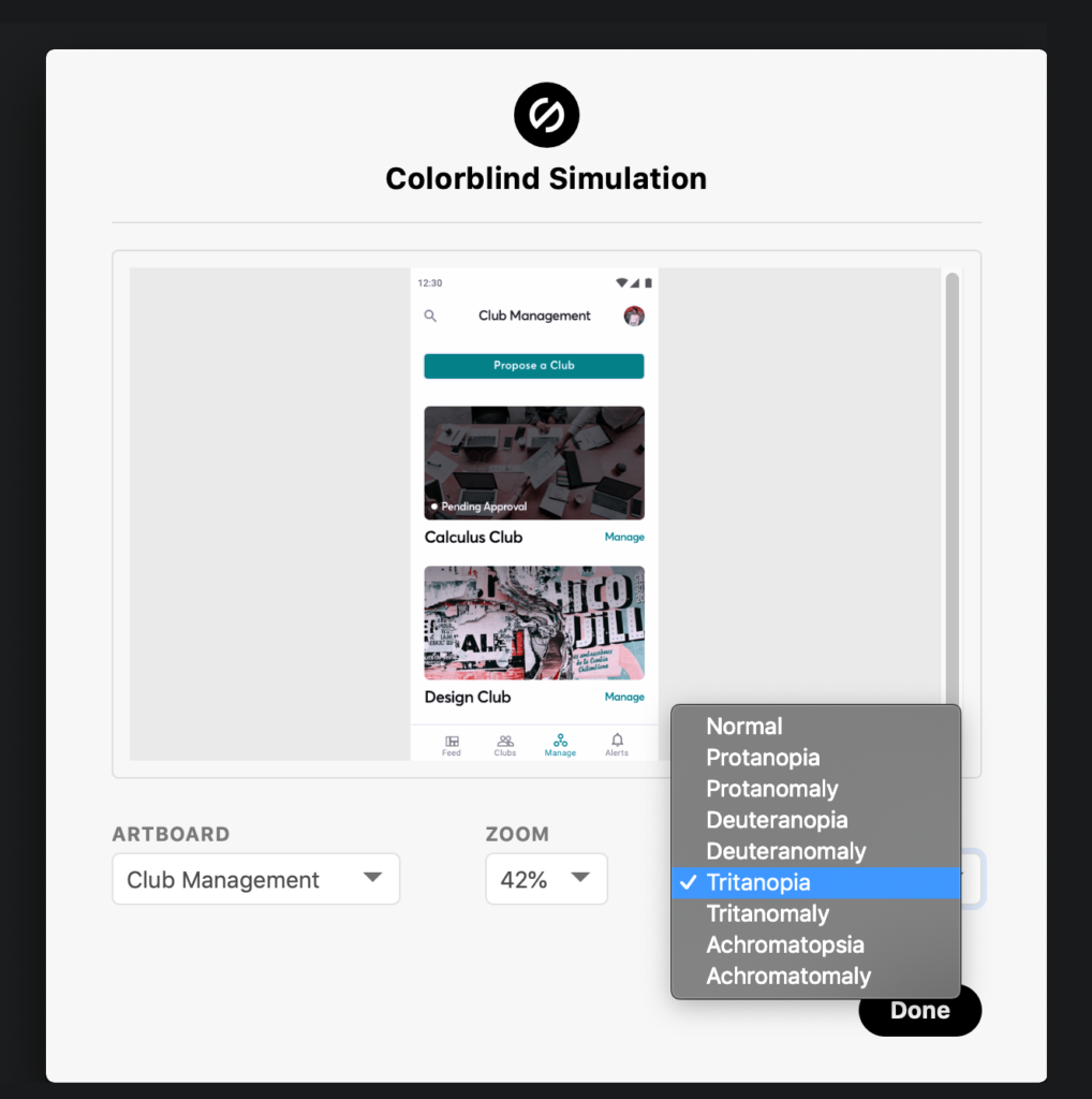
My last step before exporting my final screens, was to conduct accessibility testing. Different types of color blindness were testing against my design to see if there was difficulties with comprehension. I used a Sketch plugin called Stark to test for this, and also made sure that the rest of my content fit within the WCAG 2.0 (Web Content Accessibility Guidelines) standards. I did this extra step, to help users with impaired eyesight/disabilities. Google products have a reach of potentially billions of users, which means there is a substantial audience of users with impaired eyesight.
PRODUCT MOCKUP
