Figma Redesign Concept
Redesign concept for Figma prototyping & design system.
How can the Figma prototyping experience be re-developed to better cater to user needs, while also nurturing user sentiment in the hyper competitive design tool space?
Contributors
Myself
Responsibilities
Interaction Systems, Design Systems, Prototyping, Research
Timeline
4 Days
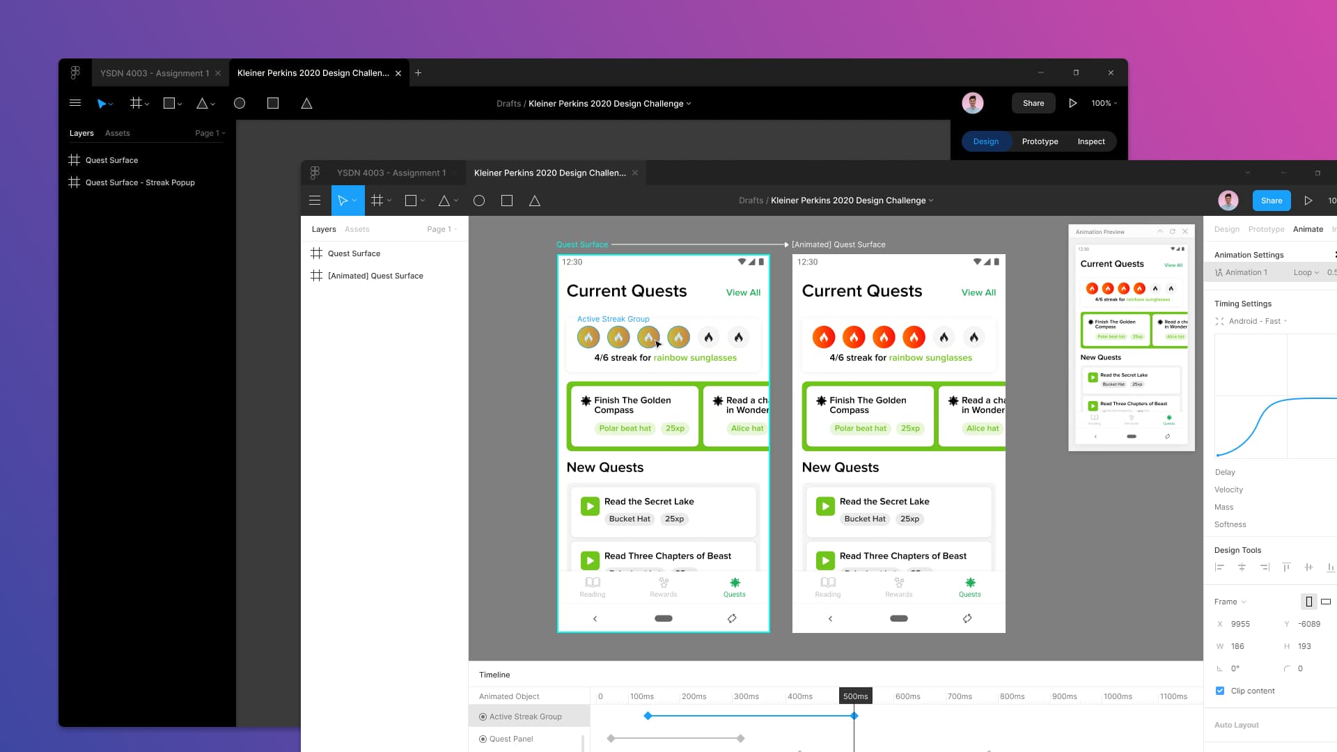
Overview
• Designers have difficulty with the current Figma prototyping experience
• Through research, a feature-rich animation system within Figma is desired and crucial to designers
• An updated design system would provide more flexibility to Figma's in-house designers
• Updating the Figma design will foster greater user sentiment within a hyper competitive space
Background
This project was developed for the Kleiner Perkins Design Fellowship application. The prompt:
"Redesign a feature from any of the companies participating in the Fellows Program. You are free to focus on any disciplinary area that you are strongest with: Visual Design, Interaction Design, User Experience, and/or User Interface Design".
Choosing a focus
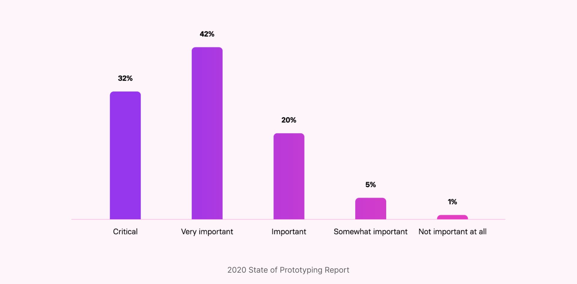
For my application I decided to choose Figma and focus on it's prototyping & animation abilities. My reason for choosing Figma was based out of frustration with the current tool. I love designing static in Figma, but for hi-fi prototyping I move to a different tool entirely, as I'm limited with what I can do in Figma. This is especially important as design leaders view prototyping most important in the user-testing stage, where high-fidelity is required (The State of Prototyping 2020).
Context
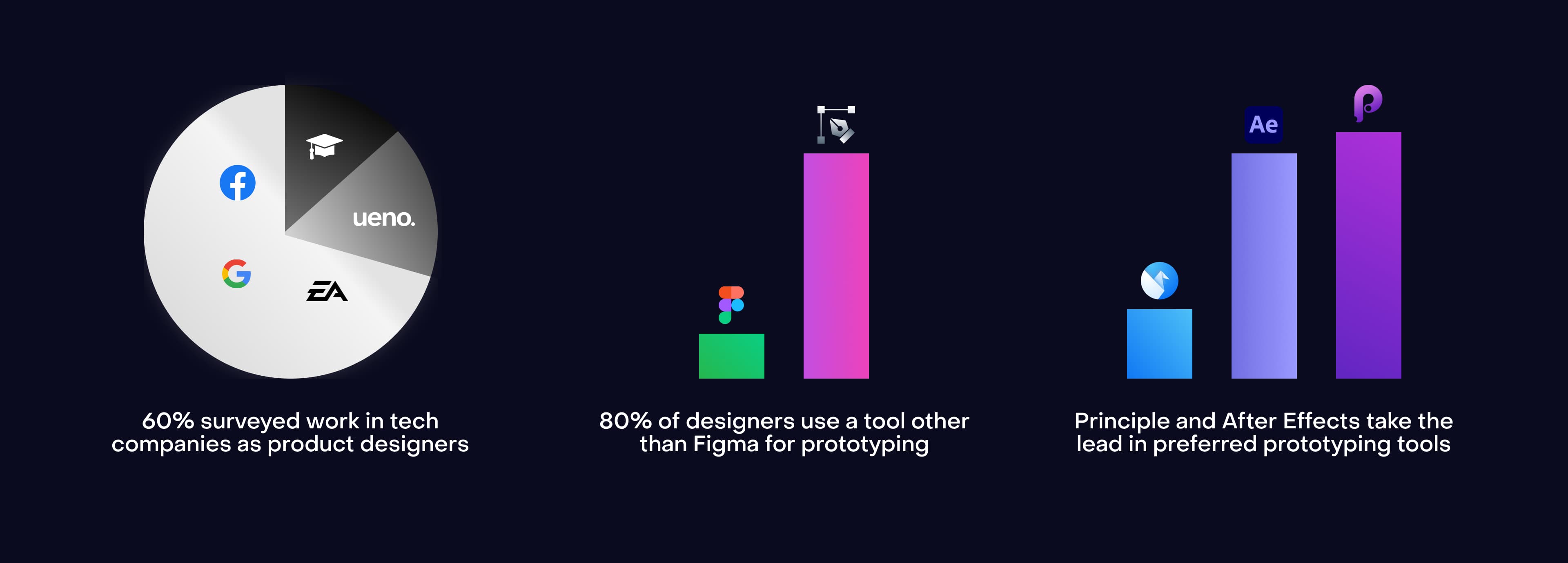
To gain an understanding of the state of Figma's current prototyping landscape, I conducted primary research through a survey to discover what designers think about Figma's prototyping tools. The dataset consists of in-house product designers, agency product designers, and design students. Participants resided in North America & Europe.
Takeaway
• Students use Figma for design & prototyping while professionals use Figma for just design
• If Figma is used, it's for fast low-fi prototyping - not high-fidelity
• Prototyping tools are used depending on team and product needs
• There is a desire for more powerful animation tools like keyframing
The Value of a Redesign
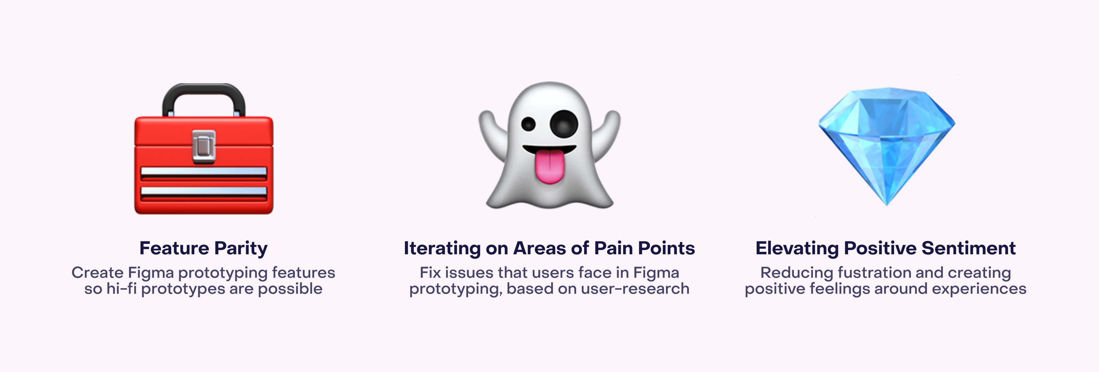
With the very importance of prototyping in a designers workflow and the fierce competition in the design tool space evolving in XD, Sketch, and Framer - the Figma prototyping toolset needs to evolve. The way I planned to accomplish this was through these three pillars:
Linking Frames
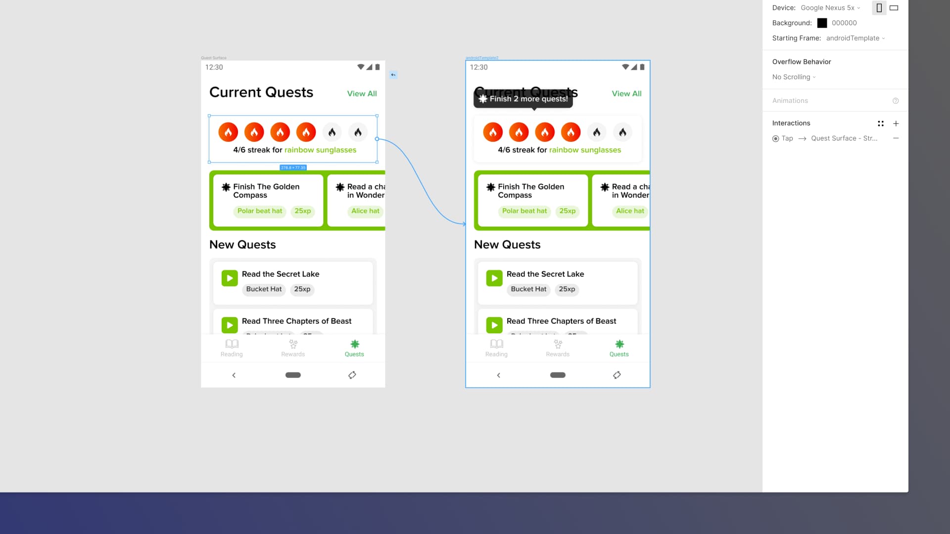
Original Prototype Linking
An issue that users can come into when prototyping is recognition of the current element they have selected. This is even more paramount when working within Auto Layout as elements are positioned within multiple layers of containers.
Proposed Prototype Linking
Greater recognition of selected elements can be achieved through highlighting and labeling. When adding the layer names clearly above a design's component, the user can swiftly decide whether to prototype that specific element or if they need to select a different one. This creates less room for error when constructing prototypes.
Prototyping Panel
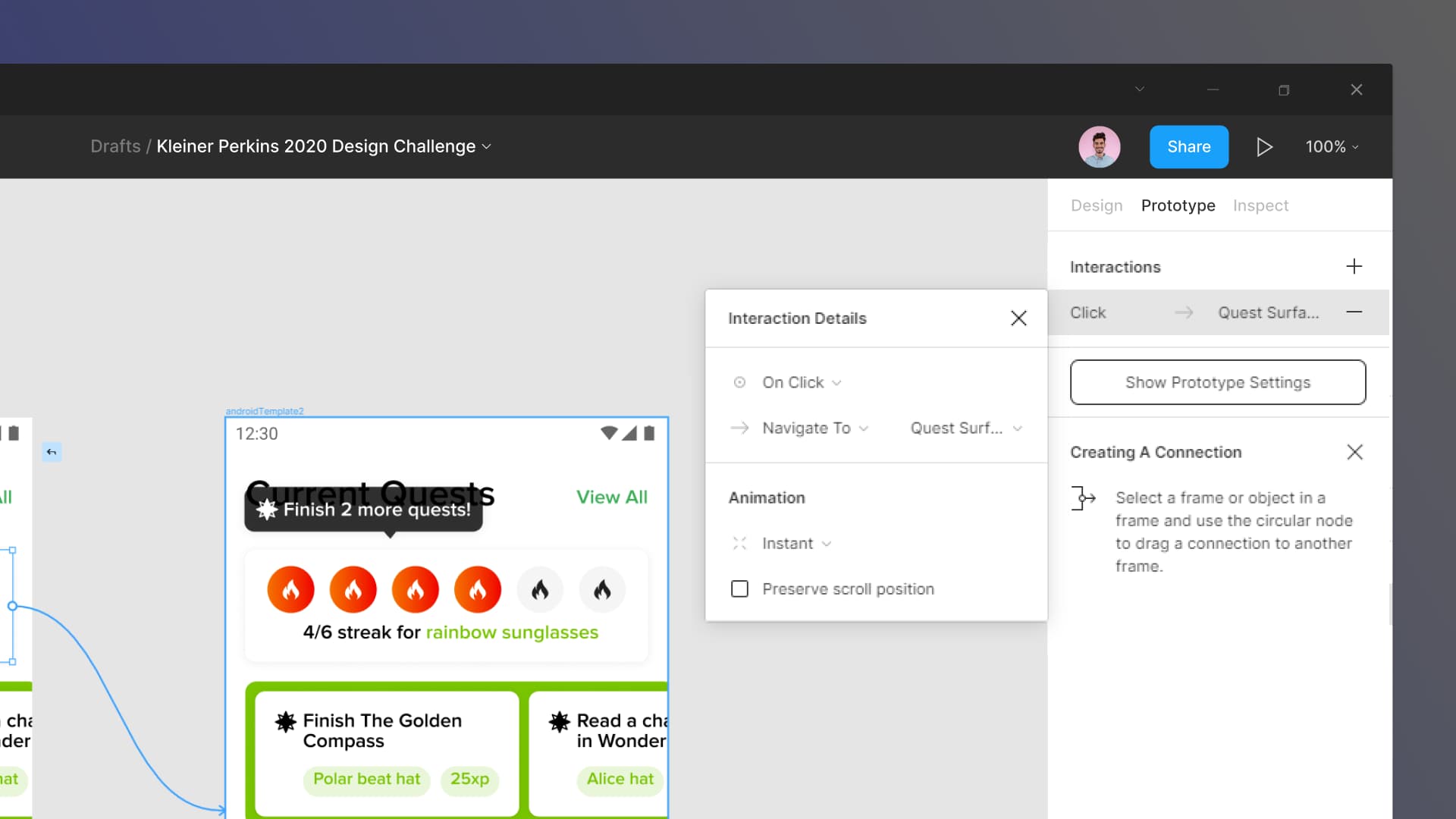
Current Prototyping Panel
Designers have no option to re-use interactions or manage them for large projects, currently having to modify interactions connections one at a time which is time-consuming and leaves room for mistakes. Prototype settings aren't persistent and are hidden between the 'Show Prototype Settings' button. Hiding these options can be problematic and can cause confusion when a hidden setting is causing unintended actions.
Proposed Prototyping Panel
The addition of interaction and animation styles no longer make large-scale changes and adhering to motion design system specifications a difficult task. This change makes the designers workflow more efficient and creates greater consistency in their work. Through also making global prototype settings persistent, confusion related to these settings can be absolved.
Animation Mode
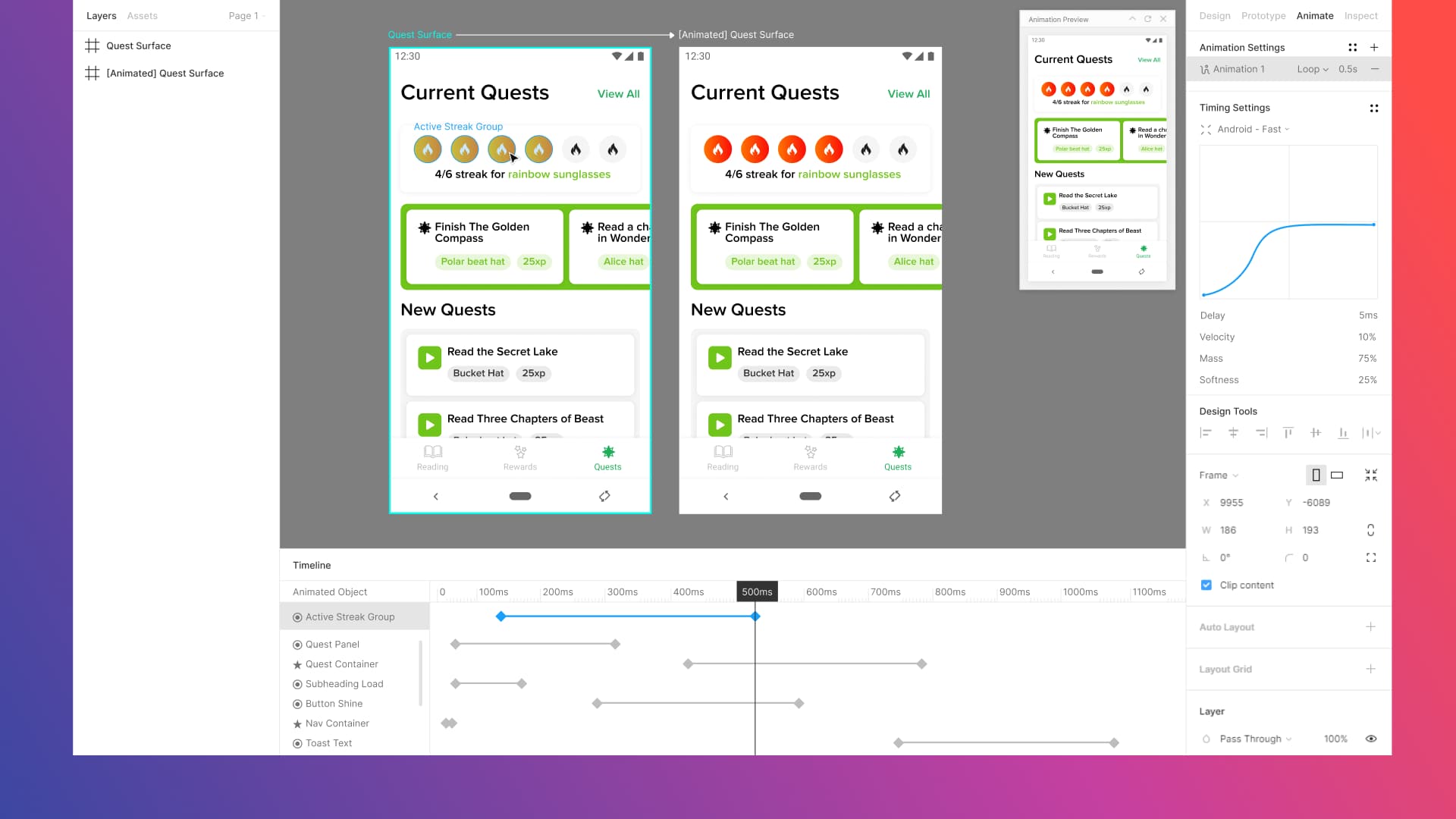
Auto-Animate + Keyframing
The proposed Figma Animation Mode brings together the speed of auto-animate and combines it with the traditional animation method of keyframing. This creates a unique hybrid approach to animation that makes it faster than traditional methods. These animations are constructed in a separate area than the design space keeping user-flows without multiple duplicate artboards for animation. Users can preview their animations in real-time and adjust the granularity of them.
The Figma Design System
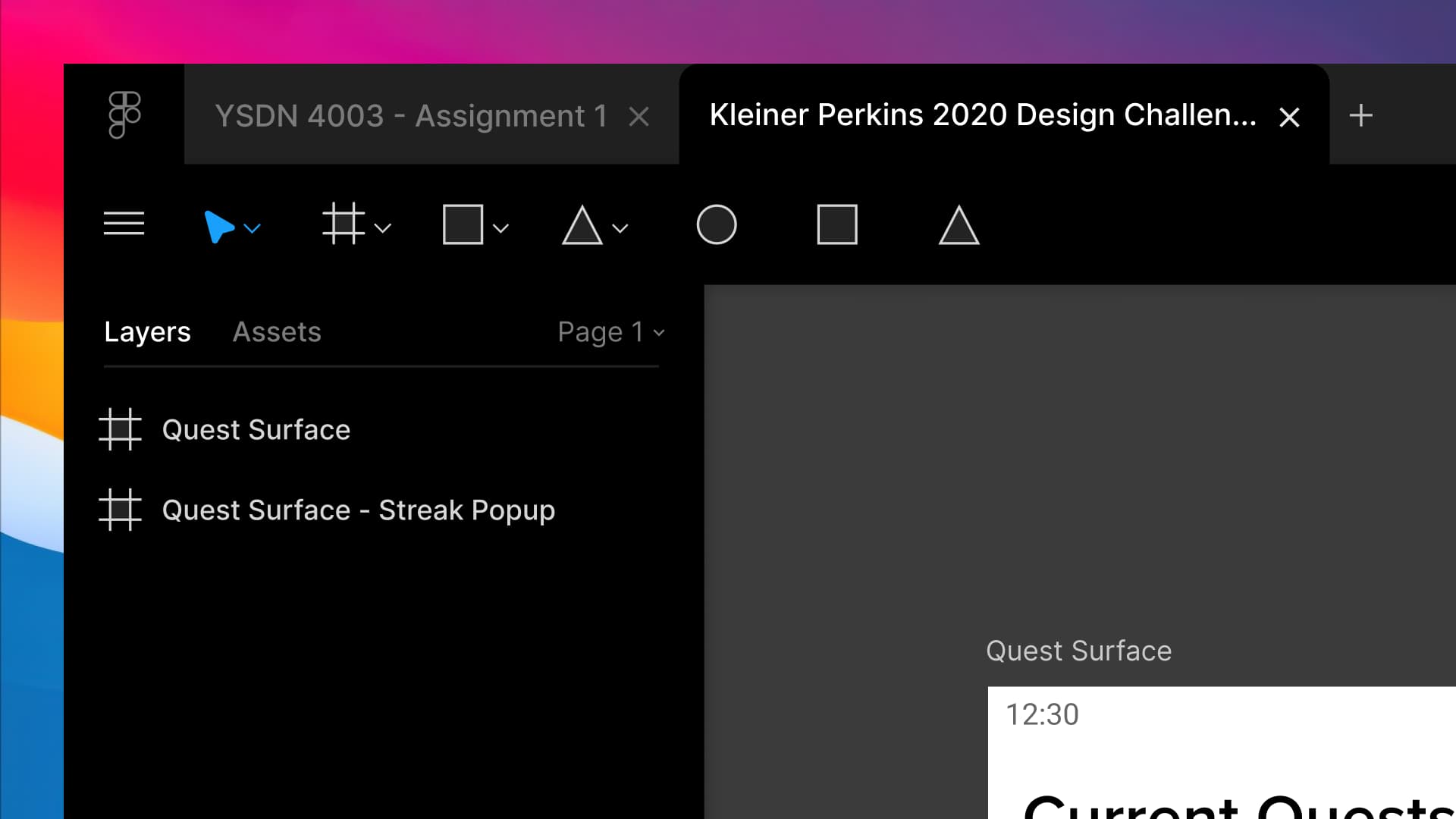
To prepare for changes of the prototyping and animation system, I started this project off by building a 1:1 replica of the Figma application. This was done so any changes I made would fit cohesively, and so that I understood part of the thinking, principles, and limitations of the current Figma design system. While integrating my ideas for prototyping and animation I found some points of frustration in working within the design system. I decided to branch off these pain points I encountered to see if I could alleviate those moments of frustration through designing solutions to them.
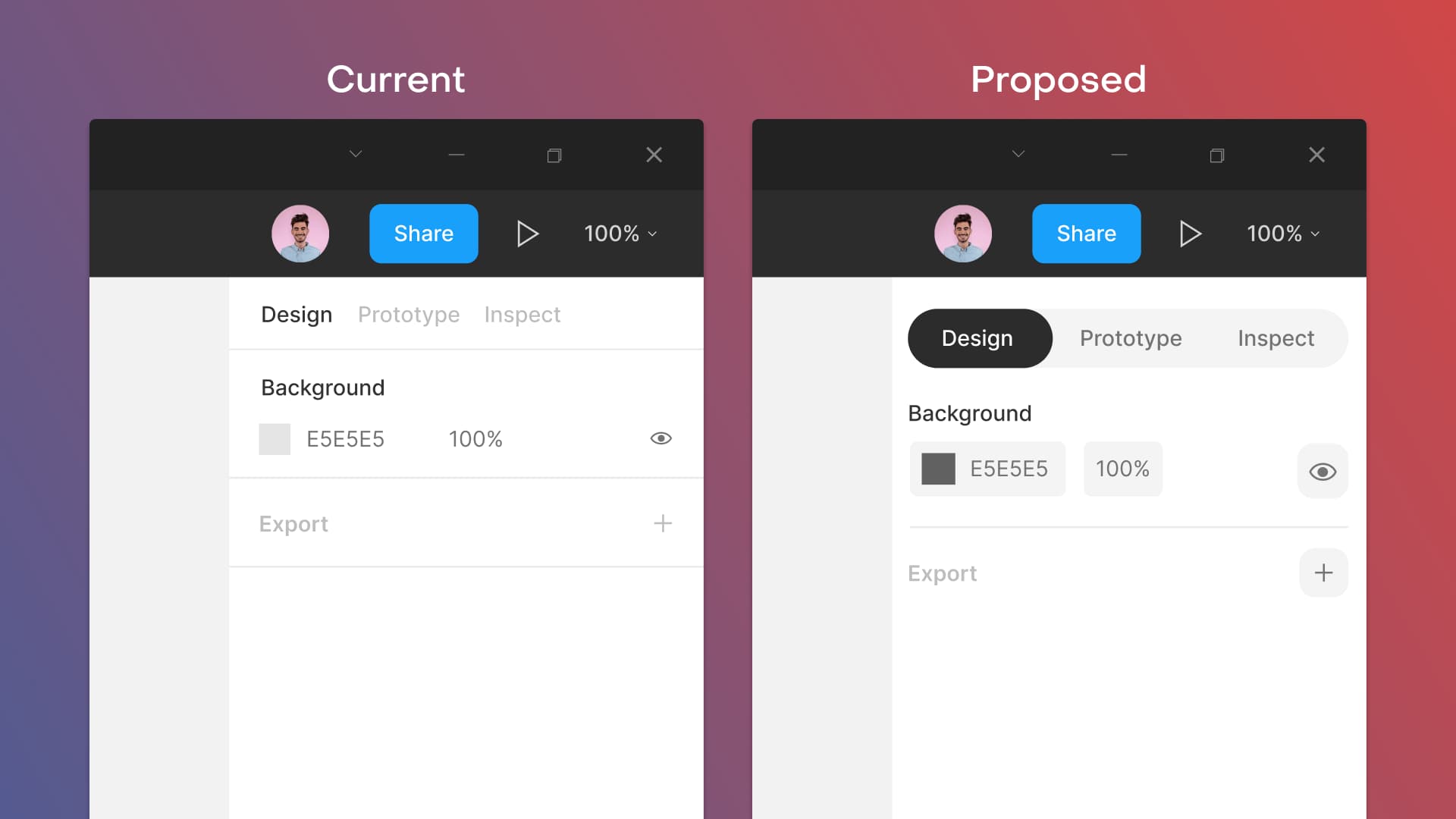
Reshaping Components
When reworking the prototyping panel and creating the animation mode I was running into difficulties with component hierarchy. There's support for four different types hierarchical elements - but I wanted more to further the effectiveness of communicating that information but didn't have the flexibility to do so. By adding containers around adjustable parameters, I opened the option to add more intricate hierarchy in Figma's design system. When making the active design mode more prominent, it gives users more contextual information to which workspace mode they're active in. This feature could be especially useful for users that are new to Figma.
Brand Identity (Darkmode)
One of the most requested features for Figma is darkmode. It's something that the app & web industry has adopted, is beneficial for users working at late hours (Take a shot for every time you've worked in Figma past midnight), would help set Figma's identity apart, and earn positive sentiment.
Accelerated Comprehension
One difficulty users may come across is recognition of tooling at a quick glance. In its current state the whole cell is populated with an active color to signify which tool is active, but this has some viewing difficulty as the contrast ratio isn't even 3:1, let alone the thin icon. Through inversing the button and filling the active tool with the active color faster comprehension and greater accessibility is achieved (Over 7:1).
Future Goals
This redesign was constructed over a tight deadline, so that created areas which I didn't have the opportunity to explore. If I had the opportunity to continue this project, this is what I would delve into:
Clustered Prototyping Perception
When working on large prototyped projects with 100's of frames all linked together, the interactions are hard to follow within the 'web' of arrows. Cleaning part of this experience up would be appreciated by designers working on large production prototypes.
User-Testing Sessions
Observing how users grasp the changes to prototyping and animation systems, and A/B testing the effectiveness of changed I made to comprehension and accessibility. My approach from this was biased and I'd especially want to see how a designer that hasn't used Figma before is able to adapt.
Prototyping + Figma Community
What if this new model of interactions and animations were embedded with the Figma Community? I think it would be a strong aspect for the design community if designers could share readymade packs of animations and interactions to the design community like Framer Packages.
A Northstar Prototype
How would the decisions I made for prototyping and the design system shift if I combined them together to create a Northstar? How could the design tool portion of Figma's interface change to be made more effective? How can animations & interactions be handed off easily to developers?